
Introducing aStuff+ v2
Using velocity, spin, location, movement, and arsenal effects to measure pitch effectiveness.


Over the past couple of seasons, pitch quality models have become critical tools to utilize when analyzing a pitcher’s performance, offering deeper insights into what combination and velocity, spin, and movement can lead to optimal pitch outcomes. Statistics such as Stuff+ (Eno Sarris and Max Bay) and PitchingBot (Cameron Grove), have been two of the most prominent pitch models available to the public over the past couple of seasons, utilizing velocity, movement, spin, and release characteristics to evaluate pitches independently of their final location. These models help pitchers design more effective arsenals, improve predictions of future pitching performance, and provide reliable evaluations even in limited sample sizes. Both Stuff+ and PitchingBot also have location-aware model counterparts, including the final location of each pitch as an additional feature to improve the descriptive performance of their models. I have been fascinated by pitch modeling ever since I first heard about the concept during the 2022 season, and I was excited to release the first version of my pitch quality model, aStuff+, last May. Inspired by the original FanGraphs Stuff+ model, aStuff+ predicted the expected run value of each pitch utilizing features such as velocity, movement, spin characteristics, and velocity and movement differences from the pitcher’s primary fastball. While the model performed well compared to other public models, my main intention with aStuff+ v1 was to utilize the model to conduct stuff-related research on other topics such as offensive performance, park factors, potential handedness bias, and continuing research on potential environmental factors at Seattle’s T-Mobile Park.
While metrics such as Stuff+, PitchingBot, and aStuff+ v1 have significantly advanced public understanding of pitching analysis, most models remain similar in their methodology, leading to comparable valuations of Major League pitchers. Recognizing an opportunity to both improve predictive accuracy and introduce unique, insightful features to pitch modeling, I set out to create aStuff+ v2, an updated version of my initial pitch quality model, utilizing new variables such as location-adjusted acceleration, altitude effects, spin efficiency and refined primary fastball interaction features. This article details my process in developing aStuff+ v2, presents its predictive and descriptive performance compared to existing public models, and introduces three new complementary models: aLocation+ (isolating pitch location effects), aPitching+ (combining pitch quality and location into one comprehensive metric), and arsenal-infused aPitching+ (incorporating how pitches interact within a pitcher’s repertoire to improve aPitching+).
Methodology:
As with most pitch quality models, aStuff+ is a machine learning model trained to predict the expected run value of each pitch. To create a target variable to represent the expected run value of each pitch, I calculated the average run expectancy of each event, grouped by count, and applied these values to their respective outcomes. For example, each 1-2 swinging strike will have the same expected run value using this method. To account for platoon splits, I also grouped each outcome by pitcher and batter handedness. I believe that this is an essential adjustment to make as the performance of certain pitches can depend on the handedness of the hitter (for example, sweepers perform better to same-handed hitters).
A majority of machine learning-based pitch quality models in the public sphere are constructed as one of the following two models: a run value-based regression model (ex. FanGraphs’s original Stuff+, tjStuff+, and aStuff+ v1) or an outcome-based classification model (ex. FanGraphs’s new Stuff+, PitchingBot, and PLV). Both types of models use the movement, spin, and velocity components of each pitch to predict outcomes, however, the main difference is that regression models directly predict the expected run value of each pitch, while the classification models predict the likelihood of various events occurring (such as whether or not a swing resulted in a whiff, whether or not a batted ball was a hard hit fly ball, etc.) then mapping an expected run value onto these probabilities.
My initial approach was to re-train aStuff+ v2 as a classification model, similar to PitchingBot and the new FanGraphs’s Stuff+. As will be shown later in the article, these models handle balls in play more effectively, given that they are directly calculating the probability of these events occurring, and I believe that the inclusion of expected event metrics such as xWhiff%, xGB%, etc. can be a valuable tool in evaluating a pitcher’s arsenal and designing pitches that can achieve specific objectives. While I believe that this approach holds promise in improving the performance of pitch quality models, this framework was simply too computational and time-intensive for me to incorporate within the model architecture of aStuff+ v2, however, I intend to take this modeling approach when I construct aStuff+ v3 in the future.
aStuff+ v2 is trained on all pitches thrown during the 2021, 2022, and 2023 seasons, utilizing data from the 2024 season for testing and model evaluation. League trends change fast in Major League Baseball (with the rise of the sweeper, splitter, and changing fastball usage patterns being recent notable examples), and it is important to consistently update the model and training set to capture these trends as soon as possible. Once there is a sufficient sample size available for the 2025 season, I look forward to adding 2024 data to the training set, and I would hypothesize that pitch types that hitters have experienced more familiarity with over time, such as sweepers, will see a slight decrease in pitch quality grade.
To predict the expected run value of each pitch, I used the following variables as predictors: velocity at release (MPH), vertical acceleration, horizontal acceleration, horizontal acceleration difference from the pitcher’s primary fastball, spin rate (RPM), spin axis, estimated spin efficiency, altitude, release extension, vertical release point, horizontal release point, and the handedness of the opposing hitter. As mentioned earlier, I took a more deliberate approach in selecting variables that are used in the updated aStuff+ model. In v1, I simply utilized metrics that were commonly used in other pitch quality models such as velocity, spin rate, induced vertical break, horizontal movement, velocity and movement differences from a pitcher’s primary fastball, etc. Given velocity’s impact on the vertical and horizontal movement of certain pitches (ex. slower four-seam fastballs experience more induced vertical break), I replaced the aforementioned movement variables with location-adjusted vertical and horizontal acceleration. Also, I included estimated spin efficiency as a feature in the model to better represent the effect that seam-shifted wake has on pitch movement (spin efficiency needs to be estimated because Statcast does not provide pitch-level spin efficiency data), and I included an altitude feature within the model to partially account for the environmental effects that can have an impact on pitch quality. I also discovered that including a variable indicating the handedness of the batter was the most effective method to account for platoon splits.
During the feature selection process, which consisted of training models with seemingly every possible combination of features, I discovered that including variables measuring the velocity and acceleration/movement differences of each pitch from the pitcher’s primary fastball often decreased the descriptive and predictive performance of the model. After running various models and taking into deep consideration the implications of the removal of these variables from the model, I decided to only include the horizontal acceleration difference from the pitcher’s primary fastball as a feature in the final model. Why did I decide to make this altercation? First, only incorporating this variable in the model improves the model’s performance relative to any other combination of “difference from fastball” features, including dropping these “difference” variables from the model entirely. Second, as later shown by the descriptive and predictive results of aStuff+ v2, including this variable in the model helps capture certain pitchers’ ability to generate sub-optimal contact, given that more horizontal movement than expected is typically an inducer of weak contact. This is particularly noteworthy in my opinion, because, as described earlier, classification models typically perform better as it pertains to understanding balls in play, however, aStuff+ v2 is comparable to the new FanGraphs’s Stuff+ when it comes to predicting next season’s wOBAcon in smaller sample sizes, a notable achievement for a regression model.
As mentioned earlier, I trained the model using an XGBoost regression model. To select the best machine learning model to construct aStuff+ v2, I utilized Microsoft’s FLAML package in Python, which determined that XGBoost was the best model to utilize for this analysis. Similar to aStuff+ v2, I decided to run one model including all pitch types rather than the bucketing approach (running separate fastball, breaking ball, and off-speed models) that some other pitch quality models follow, and I believe that this method is more appropriate for this analysis because it allows for each pitch’s effectiveness to be compared to all other pitches, rather than just pitches within their classification, and it avoids Statcast’s sometimes-subjective pitch classification process. With that being said, onto the model performance of aStuff+ v2!
aStuff+ v2:
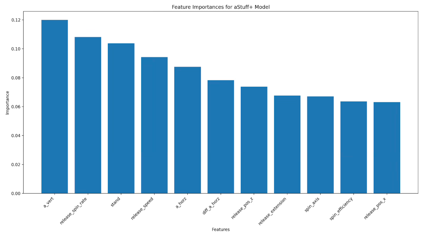
The table above displays the feature importance of all of the variables in the XGBoost regression model. As is the case with most pitch quality models, vertical acceleration, spin rate, and velocity rank as three variables of significant importance in the aStuff+ v2 model.
As I did in my previous article discussing aStuff+, I believe it is critical to emphasize the importance that horizontal and vertical release point have on the model, and when evaluating the movement characteristics of a pitcher’s pitches in general. When a pitcher throws from a higher, over-the-top arm slot, the pitcher is more likely to have a north-south arsenal (four-seam fastball with plus induced vertical break, bullet/gyro slider, 12-6 curveball), while a pitcher with a side-arm arm slot is more likely to have an east-west arsenal (sinker, sweeper, cutter). This is what is generally referred to as “expected movement” since the pitcher’s arm slot sets the hitter’s expectation for which pitches are present in their arsenal (assuming the hitter has no prior information about the pitcher, of course). If a pitcher with an over-the-top arm slot can throw an effective sweeper, or if a pitcher with a side-arm arm slot can throw a four seamer with plus vertical acceleration, then these pitches will be considered valuable since they possess movement profiles that would not be anticipated by the hitter based on their arm slot and release points.
The inclusion of arm angle on Baseball Savant’s short-form movement plots helps to visualize the relationship between release points and unexpected movement, and Max Bay’s dynamic dead zone app effectively visualizes ideal deviations from expected pitch movements, illustrating how pitches thrown from unexpected arm angles can generate better results by defying hitters’ expectations. With that being said, onto the aStuff+ v2 leaderboards from the 2024 season!
Leaderboards:
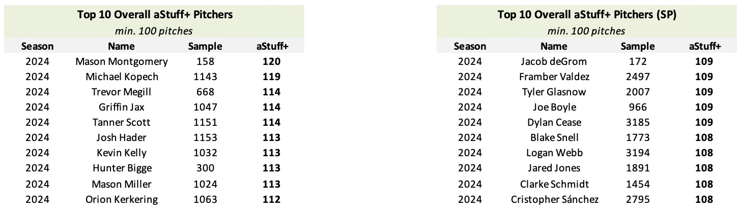
The table above depicts the 2024 aStuff+ v2 leaders, grouped by starting and relief pitchers, with a minimum of 100 pitches thrown. aStuff+ is scaled on a 100 mean / 10 standard deviation scale relative to the average pitch thrown in a given season. For example, a pitch that is graded as 110 aStuff+ has a pitch quality grade that is one standard deviation greater than the average pitch thrown in a given season. Mason Montgomery, Michael Kopech, and Trevor Megill are the leaders among relief pitchers, while Jacob deGrom, Framber Valdez, and Tyler Glasnow lead in aStuff+ among starting pitchers. The presence of Mason Miller on the leaderboard of relief pitchers resolves an anecdotal concern I had about aStuff+ v1 (which graded Miller as a 106 aStuff+) underrating pitchers with exceptional velocity, and the inclusion of Kevin Kelly, Framber Valdez, and Cristopher Sánchez on the leaderboards are indicative of the model’s ability to take into account certain pitcher’s ability to generate sub-optimal contact. With his 108 aStuff+, grading as 4th best amongst starting pitchers, Joe Boyle could be a candidate to experience improved production this season if he can even just marginally improve his command issues.
It can be noted by the leaderboards above that relief pitchers typically generate higher aStuff+ values than starting pitchers, and this can be attributed to a variety of reasons. First, since relief pitchers only face a few batters per game appearance (compared to starting pitchers who typically face a given lineup multiple times in a game), they are more likely to throw at “max effort” in-game, with the increase in velocity contributing to a higher aStuff+ grade. This effect is a primary reason why starting pitchers who move to the bullpen typically see an increase in both velocity and pitch quality grade. For example, when Mason Montgomery was used as a starting pitcher in the Rays minor league system, his four-seam fastball velocity typically sat between 91-95 MPH. Upon promotion to the Majors in September as a reliever, Montgomery’s average fastball velocity increased to 97.3 MPH, which combined with the plus shape on his four-seamer, propelled him up to the top of the aStuff+ leaderboard last season, minimum 100 pitches thrown. This trend also occurs in reverse, as Jordan Hicks’s aStuff+ grade decreased from 113 to 99 upon being moved to the starting rotation by the San Francisco Giants last season.
Another reason why relief pitchers typically earn higher aStuff+ values than starters is that starting pitchers must consistently demonstrate a higher bar of command and location ability to navigate opposing lineups multiple times through an order. As starters face hitters repeatedly within a game, their margin for error in allowing walks and poor location shrinks, while in contrast, relievers often can display a tolerance of lower command standards, relying on their elite stuff to overcome location inconsistency in shorter outings.
Predictive + Descriptive Correlations:
As mentioned earlier, the value of using a metric such as aStuff+ is in its ability to be predictive, especially in small sample sizes. Pitch quality models are typically better at predicting next season’s production than traditional metrics are at predicting themselves, and aStuff+ v2 is no exception. To evaluate the predictive performance of aStuff+ v2 against other pitch quality metrics, I calculated predictive correlations between pitch quality models (aStuff+ v1, aStuff+ v2, the original FGStuff+, and the new FGStuff+) and numerous pitch metrics among pitchers who threw either at least 100 pitches or 1,000 pitches in each of the 2023 and 2024 Major League Baseball seasons.

As shown by the tables above, aStuff+ v2 is more stable year-to-year in both small and large sample sizes than v1, and demonstrates an improved ability to predict Y2 ERA, FIP, RA/9, and wOBA than v1. aStuff+ v2 performs much better than the original FGStuff+ model in nearly every category, except K-BB%, and is noticeably better at predicting future performance on balls in play than the adjoining regression models. The new FGStuff+ model is very good at predicting future performance, especially in larger sample sizes, however, aStuff+ v2 can “hold its own” against newFGStuff+ in smaller sample sizes, displaying a slight improvement in predicting Y2 ERA and RA/9. aStuff+ v2 also displays better year-to-year stability compared to the new FGStuff+.
These correlation tables highlight a clear advantage of classification-based models, such as the new FanGraphs Stuff+, in modeling specific batted ball outcomes. However, it is noteworthy that aStuff+ v2, a regression-based approach, achieves comparable predictive performance, especially in metrics such as wOBAcon and wOBA. This finding underscores the effectiveness of a carefully optimized regression model, such as aStuff+ v2, in capturing nuanced elements of pitch quality traditionally associated with more complex classification models, such as the new FanGraphs Stuff+.
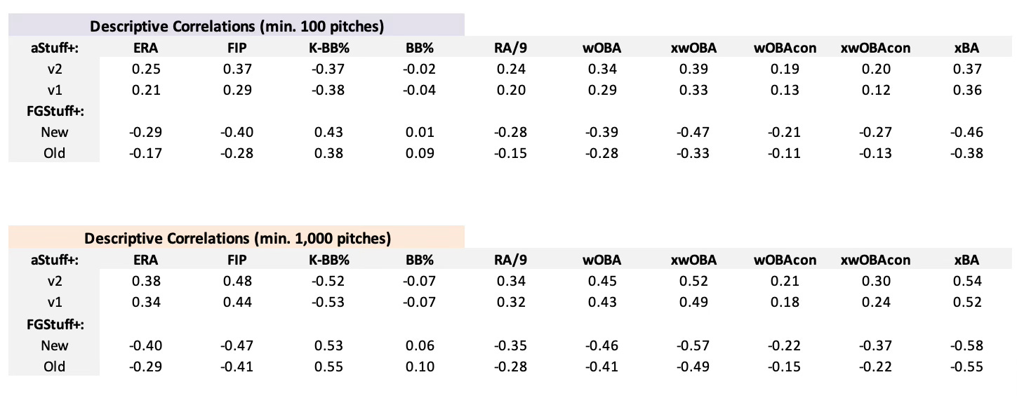
While aStuff+ v2 is designed to be a predictive measure of pitching performance, it is also important to analyze its descriptive performance to identify how well it can explain a pitcher’s production in a given season. As shown by the tables above, aStuff+ v2 displays an improvement over v1 in descriptive performance, however, performs less effectively as a descriptive measure compared to the new FGStuff+, likely due to the model's outcome-based structure. However, it is promising to report that aStuff+ v2 performs favorably compared to v1 in capturing balls in play, as indicated by the stronger wOBAcon and xwOBAcon correlations, further indicating that the difference in horizontal acceleration from the primary fastball feature was a proper choice for inclusion in the model.
Identifying Trends with aStuff+:
Pitch quality models can be used in two particular ways to identify the next trend and/or competitive advantage in pitching development in Major League Baseball. Since pitch quality models are only able to evaluate pitches based on pitches in their training set and most models tend to result in similar valuations, one element of finding a competitive advantage is to search for movement profiles that generate above-average results with below-average aStuff+ grades. In particular, “death balls” appear to be undervalued by the aStuff+ v2 model, and perhaps identifying other pitch classifications undervalued by aStuff+ v2 will be an interesting topic for a future article. A second method to finding a competitive advantage is utilizing the opposite method, identifying pitch types that grade highly in pitch quality models and developing/acquiring pitchers that throw the given pitch type often. For example, the high pitch grades awarded to sweepers at the beginning of the Stuff+ era were a significant reason why sweeper usage increased across Major League Baseball during the 2022 and 2023 seasons.
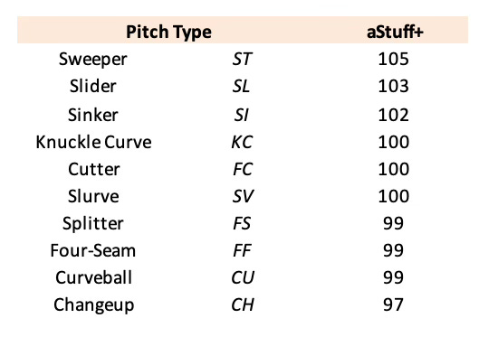
The table above depicts the average aStuff+ v2 values of all pitches thrown during the 2024 Major League Baseball season. Sweepers still grade out highly in the model, averaging 105 aStuff+, however, this grade will likely experience a decline once 2024 data is added to the training set given the league’s improved performance against sweepers as the pitch’s usage has increased. “Traditional” sliders also grade out favorably in the new model, averaging 103 aStuff+, while other breaking ball shapes settle close to league-average aStuff+. This table also sheds some light on the ongoing trend across Major League Baseball of pitchers throwing multiple fastballs and relying less on their four-seam fastball, as sinkers and cutters both grade as better fastballs than four-seamers by measure of aStuff+.
Another ongoing trend that has been occurring across Major League Baseball over the past two seasons has been the resurgence of the splitter, with usage of the pitch increasing from 1.6% in 2022 to 3.0% in 2024. Both Lance Brozdowski and I have discussed the ongoing splitter revolution over the past couple of seasons, however, outside of noting the improved production that splitters generate compared to changeups and the supination-bias friendly nature of splitters, we both did not give much explanation as to why such a revolution has been occurring in terms of movement profile. One notable finding that has been revealed by aStuff+ v2 is that, from a pitch grading perspective, generating vertical drop on an off-speed offering is more important than generating arm-side run for most pitchers.
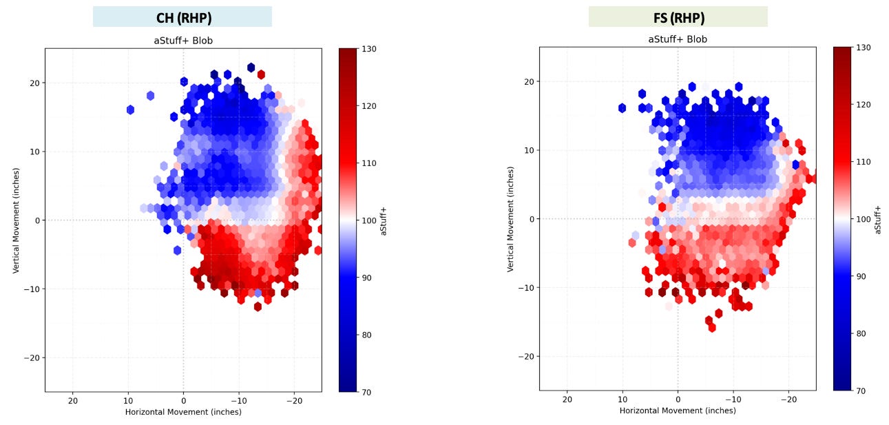
Evaluating the pitch quality of off-speed pitches can become a bit murky, as a proportion of the performance of off-speed pitches can be attributed to the offering’s velocity and movement differential from the pitcher’s primary fastball which, besides horizontal acceleration difference, is not completely accounted for in the aStuff+ v2 model. Despite this challenge, the blob graphs above display a clear trend that the model values off-speed pitches that generate vertical drop and get close to or below the “zero line” of induced vertical movement. There is still value demonstrated in generating plus arm-side run with an off-speed offering, however, achieving -20 inches of horizontal movement on a changeup is significantly more rare across Major League Baseball than approaching the “zero line” of induced vertical break with an off-speed offering.
Not only does this visualization encapsulate why splitters have seen a resurgence over the past couple of seasons, but it also helps to explain why the kick change has become such a popular changeup grip since it was popularized by Hayden Birdsong and Davis Martin last season. Discovered by Leif Strom of Tread Athletics, the kick change utilizes a spiked changeup grip, allowing for the middle finger to “kick” the pitch’s spin axis, generating more vertical drop than a typical changeup. The rise of the kick changeup and the resurgence of the splitter is a particularly important development for pitchers that exhibit supination bias, as these pitches don’t require the same amount of pronation that a traditional changeup grip necessitates, allowing for them to develop an off-speed offering to utilize against hitters of the opposite handedness that fits within their natural biases. Changeup optimization is a significant budding topic in pitching development (which will also be the topic of a future article) and utilizing a pitch quality model such as aStuff+ can provide significant value in explaining why changing the movement profile of pitches within a pitcher’s arsenal can lead to increased production.
In conclusion, the improved predictive and descriptive performance of aStuff+ v2 compared to v1, especially regarding balls in play, underscores its effectiveness as a comprehensive pitch-quality model. This refined version not only enhances existing public pitch quality analysis, but also lays the groundwork for my new complementary pitch quality metrics (aLocation+ and aPitching+) that provide a more holistic evaluation of pitcher performance.
Best aStuff+ Pitch in 2024:
Griffin Jax - 152 aStuff+ (8/24/24) - Video Link
aLocation+ and aPitching+:
In addition to aStuff+ v2, I have also created two new models: aLocation+, which quantifies the impact that pitch location has on the expected run value of a given pitch, and aPitching+, which adds pitch location as a feature to the pitch quality model. While location-agnostic models are powerful tools to utilize to evaluate and predict the future performance of performance, all forms of observers from the casual fan to the analytical savant know that the location of each pitch plays an important role in determining the outcome of a given offering. An above-average aStuff+ sinker with plus arm-side movement from a right-handed pitcher to a left-handed hitter plays a lot differently when it's located middle-middle compared to when it's located on the inner-third for a called strike.
One of the great challenges of pitch modeling is that while adding a location variable improves the descriptive performance of the model, it decreases the predictive performance of the model. This phenomenon occurs because a pitcher’s ability to locate pitches in ideal locations is less sticky year-to-year than stuff, and can be a source of variation in pitching performance within a given season. Pitchers such as George Kirby will likely always be towards the top of the aLocation+ leaderboard, and Aroldis Chapman will consistently have below-average aLocation+ values, however, there is a high amount of variation in the year-to-year location abilities of pitchers in the middle of the aLocation+ leaderboard.
A primary reason for this year-to-year variation is that locating a pitch is very difficult, even for Major League Baseball pitchers. Research conducted by Driveline Baseball indicates that the average miss distance for pitches thrown by Major League pitchers is ~12.5 inches, which is nearly 75% of the width of home plate. It should be noted that command and location are two separate things (a pitcher can have bad command and throw pitches to good locations, and vice versa), however, these two concepts are intertwined as they display the difficulty that many pitchers experience in throwing to consistent locations, and indicates the potential competitive advantage that could develop in the future for organizations who identify methods to minimize pitcher’s miss distances, resulting in them throwing to ideal locations more frequently and improving their location scores.
Most aLocation+ and aPitching+ style models utilize the precise horizontal and vertical plate coordinates of each pitch as features to indicate the location of each pitch, however, a goal of mine for this model was to attempt to make both aLocation+ and aPitching+ more predictively powerful than their public counterparts. To achieve this, I decided to replace the features utilizing the precise horizontal and vertical plate coordinates of each pitch with a feature indicating the general location of each pitch. Inspired by research conducted by Alex Chamberlain at FanGraphs and Takeshi Kono on X indicating that a bucketing approach to modeling pitch locations results in improved predictive performance, I bucketed pitch locations into 52 distinct zones, grouped by Gameday zone and whether each pitch was in the Heart, Shadow, Waste, or Chase zone. I believe that this method results in improved predictive performance over existing location models since throwing to a given location zone is a more repetitive skill year-to-year than it is to throw to the same location coordinates, measured to the nearest fraction of a millimeter.
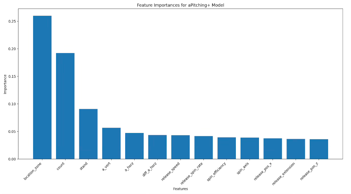
The table above displays the feature importance of all the variables included in the aPitching+ model. Similar to aStuff+ v2, I utilized Microsoft’s FLAML package in Python to determine the best machine learning model to use which was once again an XGBoost regression model. Model training was conducted on data from the 2021, 2022, and 2023 Major League Baseball seasons, with testing and model evaluation conducted on data from the 2024 Major League Baseball season. In addition to including the location zone variable in the model, aPitching+ also accounts for the count state in which each pitch is thrown in, as the value of location increases as the count deepens. Similar to other location-aware pitch quality models, location zone is the most important feature in the model by a considerable margin.
Rather than create a third model to evaluate the location quality of each pitch, aLocation+ is calculated by subtracting the expected run value of the aStuff+ v2 model from the expected run value of the aPitching+ model. I believe that this method better explains how different pitch types have different ideal locations, and the predictive and descriptive performance of aLocation+ indicates that this method better captures the effects that location has on overall pitching performance, not just the ability to minimize walks.
Leaderboards:

The table above depicts the 2024 aPitching+ leaders, grouped by starting and relief pitchers, with a minimum of 500 pitches thrown. aPitching+ is scaled on a 100 mean / 25 standard deviation scale relative to the average pitch thrown in a given season. Griffin Jax, Emmanuel Clase, and Kevin Kelly are the leaders among relief pitchers, while Framber Valdez, Tyler Glasnow, and Logan Webb lead in aPitching+ among starting pitchers. The inclusion of the location zone variable increases the model grade of pitchers such as George Kirby, Zack Wheeler, and Bryan Woo, who were not on the Top 10 aStuff+ leaderboard last season. As a side note, the aPitching+ leaderboard displays how good the Seattle Mariners starting rotation is, with four of their starting pitchers finishing among the Top 8 in aPitching+ last season.
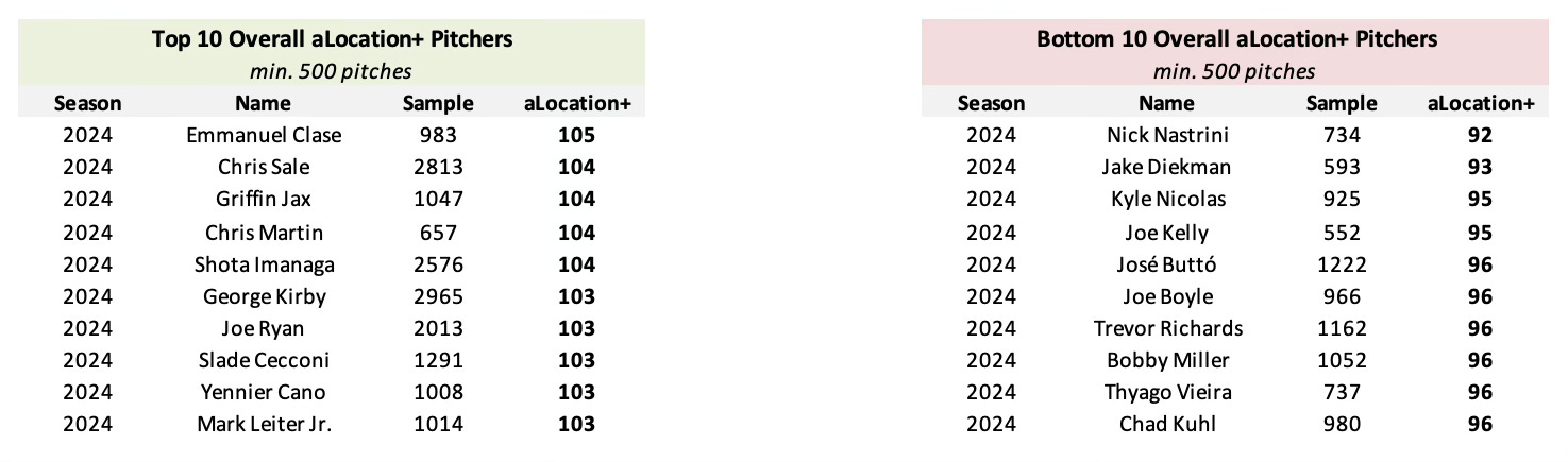
The table above depicts the 2024 aLocation+ top 10 leaders and bottom 10 laggards, with a minimum of 500 pitches thrown. Similar to aPitching+, aLocation+ is scaled on a 100 mean / 25 standard deviation scale relative to the average pitch thrown in a given season. Emmanuel Clase, Chris Sale, and Griffin Jax were the leaders in aLocation+ last season, while Nick Nastrini, Jake Diekman, and Kyle Nicolas threw to ideal locations the least often in 2024. The aLocation+ leaderboard features an interesting combination of command stalwarts such as Chris Martin, Shota Imanaga, George Kirby, and Joe Ryan and relievers who throw to ideal locations such as Emmanuel Clase and Yennier Cano. Joe Boyle continues to be a man of extremes, as one of the highest-graded pitchers by the measure of aStuff+ and one of the lowest-graded pitchers by the measure of aLocation+.

This approach to calculating the location quality values of pitches allows for aLocation+ to be dynamically evaluated across different pitch types and count states. The tables above visualize the aLocation+ values for sweepers, thrown by a right-handed pitcher to a right-handed hitter, in three different count states (shown from the catcher’s perspective). On a 0-0 count, the pitcher is rewarded for locating the pitch in the strike zone to get “ahead” in the count. On a 0-2 count, the pitcher is rewarded for locating the pitch down-and-away to get the opposing hitter to chase and penalized for throwing a “hanging” sweeper over the heart of the plate, which places the pitcher at risk for allowing significant offensive production. On a 3-2 count, the pitcher is heavily incentivized to locate the pitch in the strike zone because the outcome of the pitch will directly lead to either a strikeout, walk, or ball in play. Ultimately, this count-dependent approach to evaluating pitch locations enables aLocation+ to reward precision in strategically important counts, and highlights the nuanced relationship between location and overall pitch effectiveness.
Predictive + Descriptive Correlations:
As mentioned earlier, the inclusion of location variables in location-aware pitch quality models tends to result in an improvement in descriptive performance at the expense of predictive power, however, it was a goal of mine to improve the predictive performance of aLocation+ and aPitching+ through the use of a bucketing approach to model pitch location. To evaluate the predictive performance of aLocation+ and aPitching+ against similar pitch quality metrics, I calculated predictive correlations between public pitch and location quality models and numerous pitch metrics among pitchers who threw either at least 100 pitches or 1,000 pitches in each of the 2023 and 2024 Major League Baseball seasons.
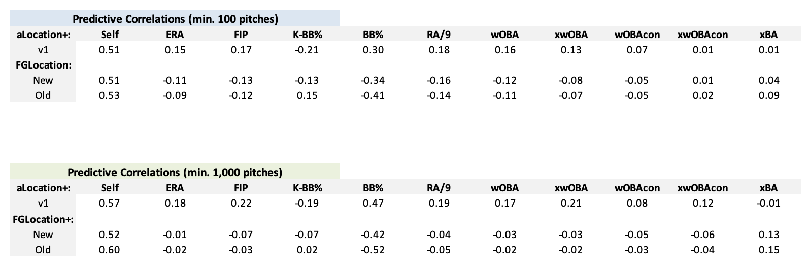
At a lower minimum sample size of 100 pitches in consecutive seasons, aLocation+ displays a similar level of stability to both FanGraphs’s Location+ models, while displaying superior predictive performance regarding Y2 ERA, wOBA, and RA/9. At a larger minimum sample size of 1,000 pitches in consecutive seasons, aLocation+ displays significantly better predictive performance regarding Y2 ERA, wOBA, and RA/9 at a higher level of year-to-year stability compared to the new FanGraphs Location+ model. As it pertains to walk rate, aLocation+ does not display as good predictive performance as the original FanGraphs Location+ model, however, it appears that FanGraphs has also made a trade-off regarding focusing on overall production over minimizing walks when evaluating the predictive performance of their old and new Location+ models.

In terms of descriptive performance, the comparisons between aLocation+ and the FanGraphs Location+ models become a bit more nuanced. In smaller samples, FGLocation+ displays superior performance, with higher correlations to ERA, wOBA, and RA/9, however, in larger samples, aLocation+ performs better than both versions of FGLocation+, displaying higher correlations to ERA, wOBA, and RA/9. Similar to aStuff+, my hypothesis for the difference in performance between these models can be attributed to the difference in style of model construction, as the outcome-based classification models can likely better attribute certain locations to specific batted ball outcomes. Modeling pitch locations can be surprisingly difficult, and I am more than satisfied with the results of aLocation+, however, I believe that this is an area of pitch quality modeling that will continue to evolve and improve if more data (such as intended zone data) were to become publicly available in the future.

Displayed in the table above are the predictive correlations between location-aware pitch quality models and various pitch metrics among pitchers who threw either at least 100 pitches or 1,000 pitches in each of the 2023 and 2024 Major League Baseball seasons. In both small and large sample sizes, aPitching+ displays greater year-to-year stability than both of the FanGraphs Pitching+ models. aPitching+ outperforms the original FanGraphs Pitching+ model in nearly all categories in both small and large sample sizes, particularly on balls in play. Compared to the new FanGraphs Pitching+ model, aPitching+ displays superior predictive performance in larger sample sizes, while both models display similar performance in smaller sample sizes.

In terms of descriptive performance, it is clear that aPitching+ performs better in larger sample sizes compared to both of the FanGraphs Pitching+ models. At a larger minimum sample size of 1,000 pitches thrown in consecutive seasons, aPitching+ performs better descriptively than the old FanGraphs Pitching+ model, displaying stronger correlations with ERA and RA/9, while displaying an identical correlation to wOBA. Compared to the new FanGraphs Pitching+ model, aPitching+ displays similar correlations to ERA and RA/9, while FGPitching+ has an advantage as it pertains to describing a pitcher’s wOBA in a given season.
Incorporating a location variable into the pitch quality model provides additional valuable context to how a pitcher achieves the results that they are experiencing on the mound, and I am looking forward to seeing the additional insights that aLocation+ and aPitching+ will be able to provide to pitching analysis throughout the upcoming season.
Best aLocation+ and aPitching+ Pitch in 2024:
Sean Manaea - 124 aStuff+, 221 aLocation+, 229 aPitching+ (6/1/24) - Video Link
Stabilization Points:
As mentioned earlier, the value in utilizing a pitch quality model such as aStuff+ is that the model is able to provide reliable signal in small sample sizes. Unlike traditional statistics, such as ERA, which can take multiple weeks or months to provide reliable insights into a pitcher’s “true” talent level, pitch quality models can provide a reliable signal within a few outings.
Most pitch quality models, such as the FanGraphs models, use Cronbach’s Alpha to identify the sample size required for each of their metrics to stabilize and provide a reliable signal for analysis. I am not familiar with utilizing Cronbach’s Alpha to conduct stabilization analysis, so instead, I took direct inspiration from Thomas Nestico’s tjStuff+ model and determined the median stabilization point by identifying when a pitcher’s aStuff+, aLocation+, or aPitching+ does not deviate by a certain threshold over every 10 pitches, starting with 10 pitches (for more detail regarding Thomas’s method for calculating stabilization, please click on this link). Since choosing a level of stabilization using this method can be rather subjective, I calculated the stabilization point for each metric at various thresholds.

The tables above depict the varying levels of stabilization for each of the three pitch quality metrics. Displayed in bold lettering are the levels of stabilization that I believe are most important for obtaining a reliable signal of stabilization which is the deviation of +- 0.25 aStuff+, and +- 0.10 aLocation+ and aPitching+. As displayed by these stabilization points, pitchers display a reliable signal of their aStuff+ after 78 pitches thrown (one or two starts for a starting pitcher, around four appearances for a relief pitcher), and a reliable signal of their aLocation+ and aPitching+ after about 330 pitches thrown. At the lowest threshold of stability, aStuff+ can provide a reliable signal in a very small sample size, indicating that an aStuff+ outlier can likely be reliably identified after only 28 pitches thrown. The ability of pitch quality models like aStuff+ to stabilize quickly is an important attribute of this type of modeling and is a significant reason why pitch quality modeling has a large impact on how pitchers are evaluated in the modern age.
“Experimental Models”:
Arsenal-infused aPitching+:
In addition to aStuff+, aLocation+, and aPitching+, I have also created a series of what I call “experimental models” that I am planning to fully release at a later date. The first, and perhaps most notable, experimental model that I have created is arsenal-infused aPitching+. In my opinion, the next frontier of pitch modeling is the ability to model how well certain pitches interact with each other within a given pitcher’s arsenal. While existing pitch quality models, such as aStuff+, are incredibly valuable tools to use in evaluating a pitcher’s production, “stuff” models in the public sphere have largely been optimized, with nearly all of the existing public pitch models valuing similar players. While there does appear to be room for growth in terms of modeling command (as discussed earlier), I believe that an improved ability to model arsenal effects is the next frontier of pitch modeling and can provide analysts with a clearer understanding of how some pitchers might over or underperform the results expected by existing models.
The concept of modeling arsenal effects was first introduced to the public sphere via a presentation at Saberseminar by Marek Ramillo and Jack Lambert of Driveline Baseball this past August. In the presentation, Ramillo and Lambert unveiled two new metrics, Mix+ and Match+. Mix+ attempts to measure the breadth of a pitcher’s arsenal (how large of a velocity and movement band does a pitcher’s arsenal cover), while Match+ attempts to measure how similar a pitcher’s pitches look to the opposing hitter at the hitter’s decision point. Mix+ and Match+ for each pitcher are then combined to create an overall arsenal metric, which can be utilized to grade how well a pitcher’s arsenal is constructed.
Since this presentation, similar research has been conducted by Maxwell Resnick on pitch tunneling and Stephen Sutton-Brown of Baseball Prospectus on a different approach to quantifying arsenal effects. To construct my own arsenal metric measuring arsenal breadth, aMix+, I calculated how large of a velocity and movement band each pitcher’s arsenal covers.

Similar to aStuff+, aMix+ is scaled on a 100 mean / 10 standard deviation scale relative to the average pitcher’s arsenal breadth in a given season. As shown by the table above, among pitchers with at least 500 pitches thrown, Landen Roupp, Hogan Harris, and Caleb Thielbar displayed the largest pitch arsenals in Major League Baseball last season by measure of aMix+. Among starting pitchers, Chris Bassitt, Chris Sale, Max Fried, and Bowden Francis possessed some of the league’s deepest arsenals. I made an initial attempt to construct a tunneling metric, aMatch+, which featured pitchers such as Jose Quintana, Michael Lorenzen, and Sonny Gray as league leaders, however, I do not exhibit sufficient confidence in the method in which I constructed this metric to include it in this analysis. Identifying a more effective way to quantify the tunneling interactions between pitches, similar to Driveline’s Match+, will be a particular focus of research moving forward.
In addition to calculating aMix+, I decided to take this arsenal effect research one step further and attempt to incorporate the breadth of a pitcher’s pitch arsenal as a feature in aPitching+. Research conducted by Driveline and Sutton-Brown indicates that hitters make worse swing decisions when facing pitchers with a deep arsenal, and perhaps by incorporating this variable into a location-aware pitch quality model, we can improve our ability to evaluate pitching performance.
To conduct this analysis, I calculated the size of each pitcher’s velocity and movement band among pitches thrown in a given season, weighed by usage, and mapped this value back to each pitch thrown in a given season. In addition, while I resisted including pitch classifications as a feature in the aStuff+ and aPitching+ models, I had to include a pitch classification variable (fastball, breaking ball, or off-speed) as a feature to “nudge” the model to better learn and understand arsenal effects. Similar to the previous two models, I utilized Microsoft’s FLAML package in Python to determine the best machine learning model to use which was now a LightGBM regression model. Model training was conducted on data from the 2021, 2022, and 2023 Major League Baseball seasons, with testing and model evaluation conducted on data from the 2024 Major League Baseball season.

As shown by the table above, arsenal-infused aPitching+ displays an improvement in descriptive performance compared to arsenal-agnostic aPitching+ in both small and large sample sizes among starting pitchers. Arsenal-infused aPitching+ reigns as the superior predictive regression model in small and large sample sizes, while the new FGPitching+ still holds a descriptive advantage in larger sample sizes.

In terms of predictive correlations among starting pitchers, arsenal-infused aPitching+ is less stable year-to-year than arsenal-agnostic aPitching+, however, arsenal-infused aPitching+ displays stronger correlations to nearly every Y2 metric among all four models. Note that I only ran the correlations with starting pitchers, which I define as pitchers who started in at least 50% of their games pitched in a given season. This is because arsenal-infused aPitching+ performs worse with relief pitchers as both a descriptive and predictive metric than arsenal-agnostic aPitching+.
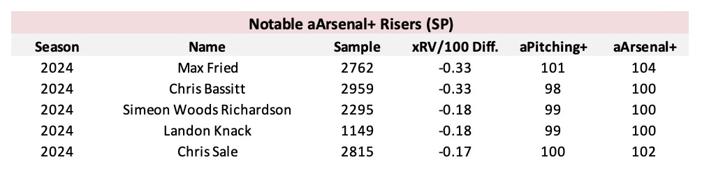
Similar to aPitching+ and aLocation+, arsenal-infused aPitching+ is scaled on a 100 mean / 25 standard deviation scale relative to the average pitch thrown in a given season. The table above depicts notable risers in arsenal-infused aPitching+ compared to their arsenal-agnostic aPitching+ grades. The aforementioned aMix+ leaders such as Max Fried, Chris Bassitt, and Chris Sale are featured on this leaderboard, while other large arsenal pitchers such as Simeon Woods Richardson and Landon Knack also experience an increase in their aPitching+ grades.
While the initial results of arsenal-infused aPitching+ are certainly promising, especially as it pertains to starting pitchers, there are a few elements of the model that I would like to refine before fully releasing the model to the public. First, while the performance of the model appears to validate the approach of mapping uniform arsenal values to each pitch a pitcher throws in a season, it biases the model slightly, placing a larger emphasis on how a pitcher’s arsenal is constructed towards the end of the season. For example, Corbin Burnes has added a sweeper to his arsenal towards the end of summer in each of the past two seasons, however, the arsenal-infused aPitching+ models act as if the pitch was in his repertoire all season. Perhaps incorporating a rolling window of arsenal breadth would resolve this issue and potentially improve the performance of the model. Second, while the list of arsenal-infused aPitching+ risers indicates that the model is capturing the effects that arsenal breadth has on pitcher performance, the model’s improved performance could also be attributed to the inclusion of the pitch classification variable. Whether or not this is even a negative feature of this model is an open question, however, I would like for arsenal-infused aPitching+ to be consistent with arsenal-agnostic aPitching+, and this variable is a notable difference between the two models.
Overall, I am excited that arsenal-infused aPitching+ has displayed improved descriptive and predictive performance over arsenal-agnostic aPitching+ among starting pitchers and is another development in quantifying the arsenal effects of Major League Baseball pitchers on the public side. I am looking forward to utilizing the metric in my pitching analysis throughout the upcoming season, and am tentatively planning for the metric to be released to the public over the summer.
Best arsenal-infused aPitching+ Pitch in 2024:
Chris Bassitt - 115 aStuff+, 176 aLocation+, 182 aPitching+, 195 arsenal-infused aPitching+ (7/25/24) - Video Link
velocityStuff+ and movementStuff+:
Another experimental metric that I have created is velocityStuff+ and movementStuff+. The inspiration for these two metrics came from a recent post I saw on X from the account Reds in Four:

The idea of quantifying how much of a pitcher’s pitch quality grade can be attributed to the pitch’s velocity or shape to assess a pitch’s potential sensitivity or velocity fragility appears to be an interesting concept, so I decided to attempt to quantify this effect utilizing the aStuff+ v2 model. To quantify this effect, I simply calculated the SHAP value of the velocity of each pitch, declared its value to be the “velocity stuff value”, then subtracted this value from the expected run value of the pitch, creating the “movement stuff value”. Similar to aStuff+, these values were scaled on a 100 mean / 10 standard deviation scale relative to the average pitch thrown in a given season, creating velocityStuff+ and movementStuff+.

As shown by the tables above, the leaderboard for velocityStuff+ is filled with some of the hardest throwing pitchers in Major League Baseball (such as Emmanuel Clase, Justin Martinez, and Mason Miller), while the leaderboard for movementStuff+ is filled with pitchers with plus fastball shapes, big sweepers, and Devin Williams’s airbender changeup. Admittedly, I do not foresee much practical use in dividing aStuff+ into two separate metrics, as both velocityStuff+ and movementStuff+ exhibit a decline in descriptive and predictive performance compared to aStuff+ v2, however, these metrics could perhaps be utilized to provide observers unfamiliar with “ideal” pitch shapes more context into how aStuff+ grades are generated. I will be keeping an eye on these metrics throughout the season to see if they can generate any additional value in evaluating pitching performance.
Concluding Thoughts:
Overall, I have been impressed by the performance of my new pitch quality metrics, and I am excited to see what new insights these metrics can provide to baseball analysis in the future. In addition to maximizing performance, my primary goal was to differentiate my approach to pitch modeling from existing public models, and I hope that the feature selection process for aStuff+, the bucketing approach for modeling pitch locations, and the incorporation of arsenal effects into aPitching+ will lead to valuable insights into how pitching performance can be evaluated.
While these pitch quality models perform quite well, there are a few limitations to these models that should be discussed. First, while the inclusion of an altitude feature limits the effect that altitude has on pitch movement, there are still other various environmental effects that can affect pitch movement that are not accounted for in the model. For example, higher levels of salt content in the air can improve pitch movement (notably at Petco Park in San Diego), and wind patterns can also play a factor in altering pitch movement. Unlike altitude, these variables are either very difficult or impossible to compile publicly and therefore, were not included as features in the model. Second, there are no inputs in the model that describe the sequencing of each pitch. While there has been some compelling recent research regarding sequencing effects, each attempt to include sequencing variables into the aPitching+ model resulted in a decline in descriptive and predictive performance. While difficult to model, pitch sequencing intuitively plays a role in the effectiveness of certain pitches, and will certainly be a continuing topic of research moving forward.
Leaderboards containing aStuff+, aLocation+, and aPitching+ data from the 2025 Major League Baseball season are currently available on Substack for public use. In addition, I have also included aStuff+, aLocation+, and aPitching+ data of both Major and Minor League pitchers from the 2023 and 2024 seasons, and aStuff+ data of College pitchers (in Statcast games) from the past three seasons on Substack as well. I am currently working on other visualization tools which should become available during the coming weeks and months. In conclusion, I am excited to finally release these pitch quality models to the public and I am excited to see all of the insights that these models will provide in the future.
Thanks for reading!
Follow @MLBDailyStats_ on X and Adam Salorio on Substack for more in-depth MLB analysis. Photo credits to Gregory Fisher / USA Today.
*View the current aStuff+ leaderboards at the attached hyperlink*
Special thanks to Owen McGrattan, Cameron Grove, Thomas Nestico, Drew Haugen, and Driveline Baseball, as my pitch quality model would not be possible without their respective publications on the topic.